User Interface, User Experience Design, Figma, Wireframing
VON Diamonds is a diamond brand with an e-commerce presence, launched to the public in October 2023. It caters to the consumer base that looks for deals, and takes inspiration from brands like GAP for its brand identity and aesthetics. VON Diamonds aims to convert consumers who are unsure of their preference between natural and lab grown diamonds sheerly through the competitive price of lab grown products.
OPTIMIZING USER EXPERIENCE ACROSS DEVICES
As layout differs across devices, experiences need to be tailored to respective devices.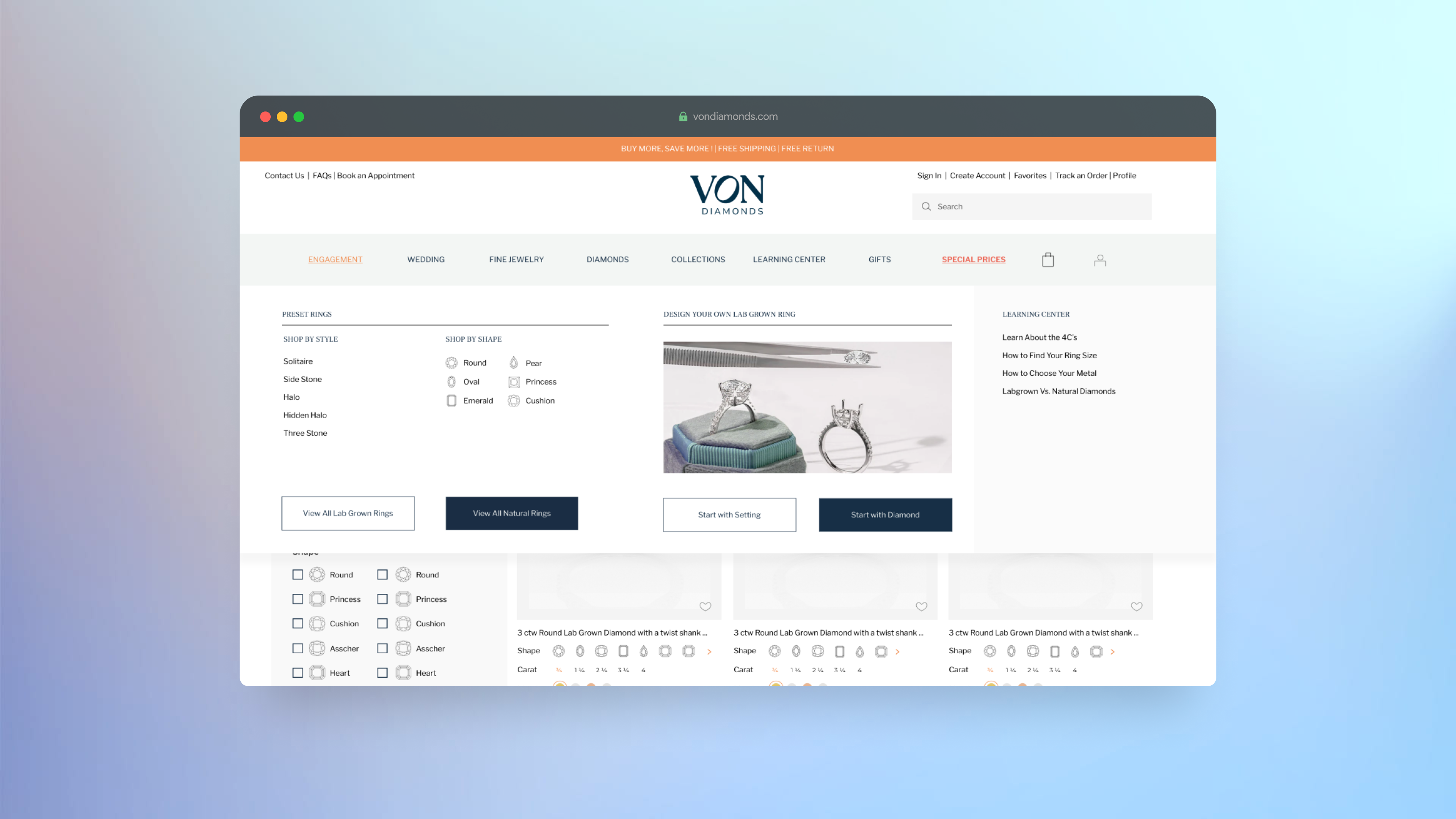
The Engagement Ring navigation contains categories with the types of products offered and the different ways to shop. The menu contains a lot of interactive information that is laid out neatly for desktop.
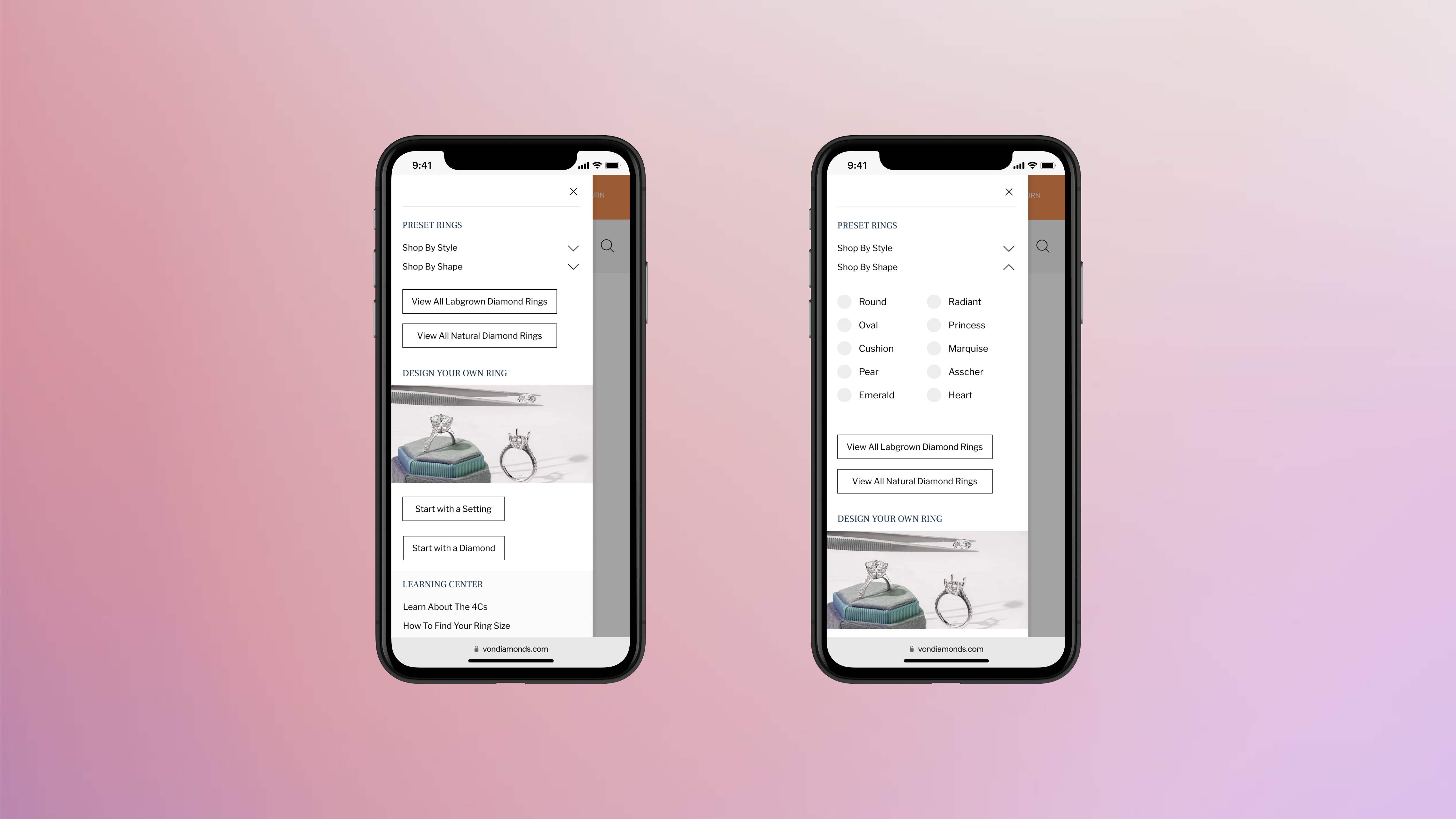
For mobile, simply laying out all the information from the desktop navigation increases the taps needed to get to a clickable link and the scroll to 2x or 3x, which is a source of frustration for users.
VON is a new brand and currently does not have a large amount of product on the site, which means that a range of 5-10 total products are shown when shopping by category under Engagegement. This is not enough product for customers to browse through when having selected a category from the navigation.

For a more optimized browsing experience, all preset engagement rings are combined in the navigation for mobile under Preset Rings. Users can discover more product, and the filters replace the categorization of product to satisfy users with specific requirements.
Live Site︎︎︎
DIAMOND FEED FILTERS
The Diamond Feed is a shopping experience different from the rest of the site as customers can shop for loose diamonds, and design their own engagement rings with a custom setting.The feed has almost 40,000 total products, which makes the filtration system extremely important for users to be able to navigate through the results and find what they are looking for.
The filters need to be easy to understand and use, and every single product variant should be reflected in the filters for users with specific requirements to easily find their desired product.
The filters follow a certain hierarchy that reflects the needs of the general customer from highest to lowest priority, determined through user research.

 Live Site︎︎︎
REDESIGNING THE LEARNING CENTER
The Learning Center is the most important educational page, as it helps customers understand the differences between each of the four C’s – Cut, Color, Clarity and Carat.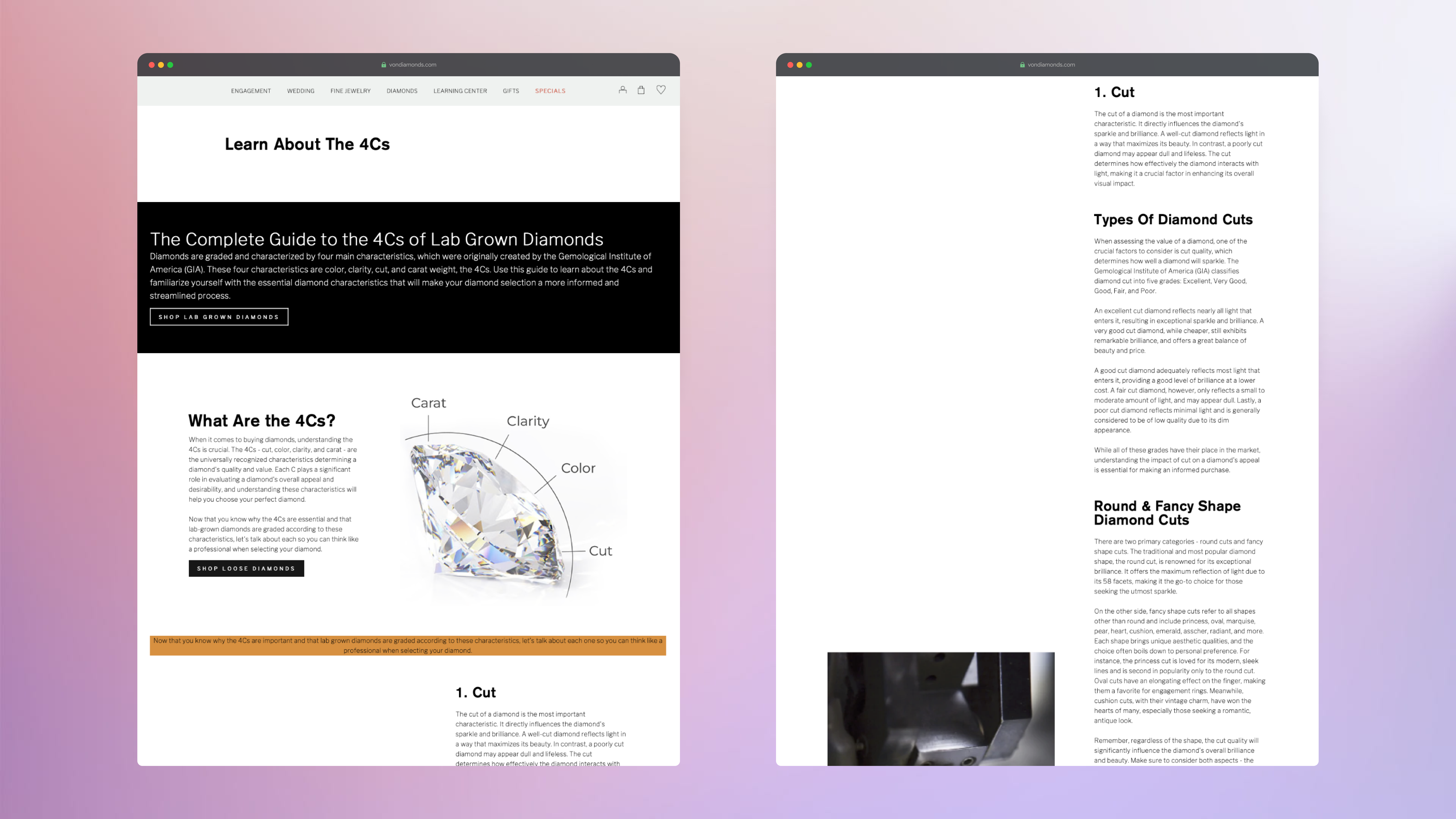
The old Learn About The 4Cs page was difficult to navigate through due to the inefficient layout of the information and the white space, as seen above. The information was cluttered and placed at the same level in the hierarchy, making it hard for users to understand the information and identify what to prioritize.
The redesign focused primarily on getting rid of the large blocks of negative space and making the information more legible.

The redesigned page tackles: (1) consistency in branding and fonts, (2) clear information hierarchy, (3) space optimization, and (4), appeal of information.
(1) All titles, subheadings, body text and buttons are updated according to the brand typography and color palette.
(2) The information is restructured to show a clear hierarchy through layout, headings and visual cues.
(3) The full width of the page is used to display the information to optimize space and direct the eye throughout the page.
(4) An image is added to each section to segregate the information and make it easier to follow.
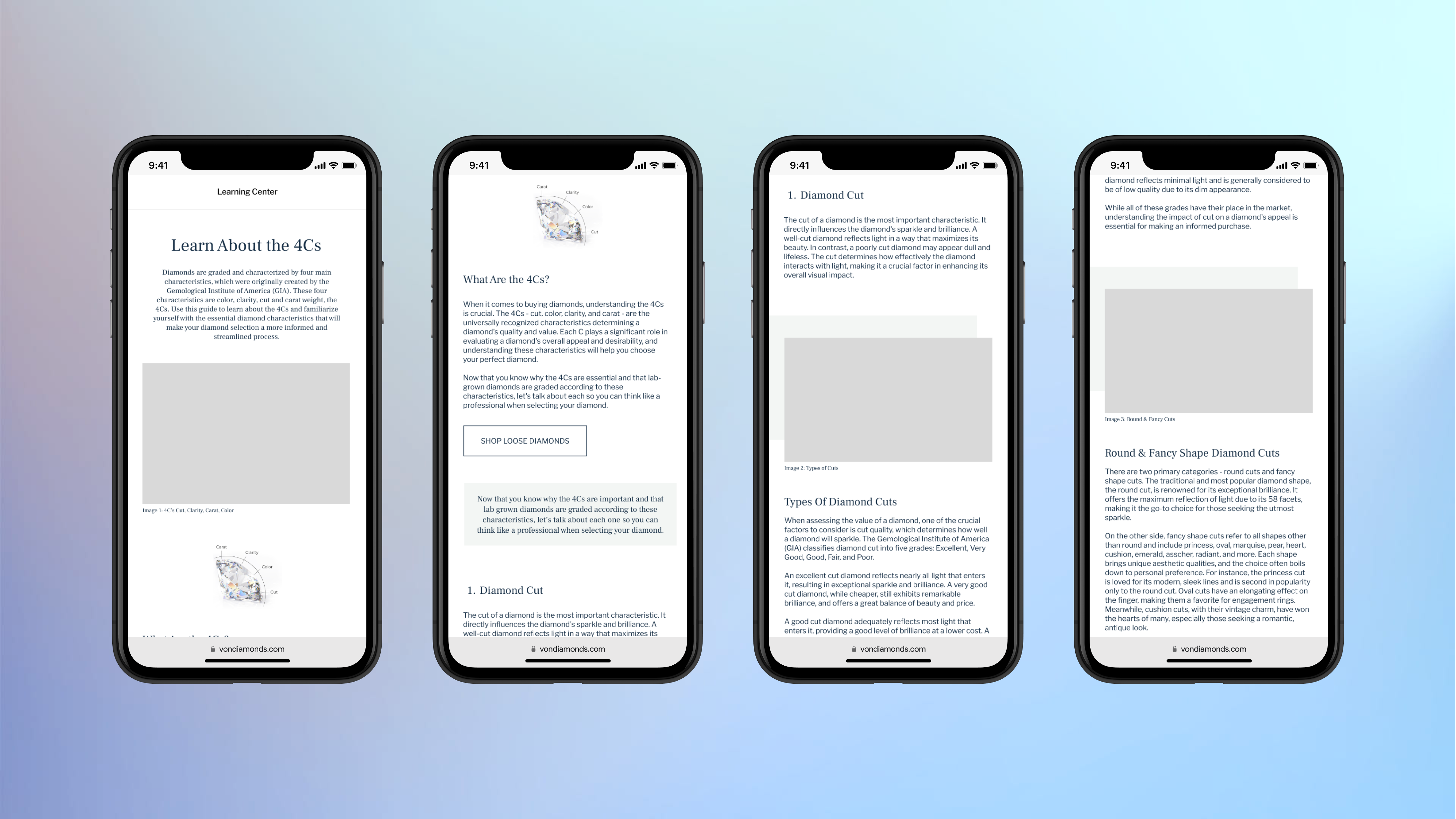
The page is redesigned for mobile as well, displayed above, and follows a similar structure as the desktop version.
Live Site︎︎︎
BRAND ARCHITECTURE
Creating the brand architecture is vital to achieve cohesiveness across the different sections of the website and establish the identity of the brand.
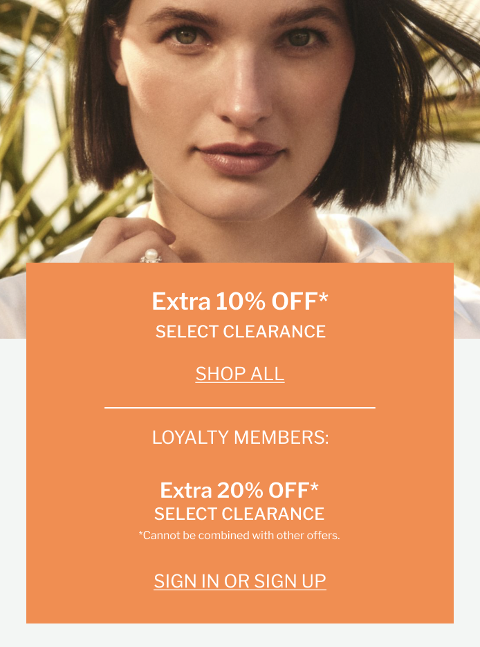
As VON Diamonds is a newly established brand, the homepage, especially, needs to make use of the primary colors of the brand palette as an initial introduction to the brand identity.
I created various reusable components, such as the header, the footer, and banners that could be updated with new information at any time.