GROW XR 2023
Unity, C#, Lenovo ThinkReality AR Glasses, Blender, AdobeXD
GROW XR is a virtual platform that assists patients in long-term care in their treatment and rehabilitation journeys through assistive features around restoration and rehabilitation.
Link to GitHub Repository︎︎︎
❝ Physical therapy sucks. I wish it was more like video games, but it’s not– it’s boring. ❞
— Will’s niece, Ori Pearson
— Will’s niece, Ori Pearson
THE
PROBLEM
Patients going through long-term treatment often feel that they are living a repetitive daily life. It becomes easy for them to lose sight of an end to the treatment, the pain, and the symptoms.
- Patients going through treatment and/or rehabilitation are fatigued by performing a repetitive daily routine– taking the same medication, conducting the same physical exercises, and answering the same questions about their wellbeing.
- Patients often do not see an end to their pain and treatments. They lose sight of their progress, milestones and their own nonlinear path when there is no end in sight.
- Patients often reach an end only to realize it was not an endpoint. Instead, they experience secondary or induced pain that overshadows the progress they have made so far, and leaves them fatigued of being sick and the continued effort they need to put into going through treatment.
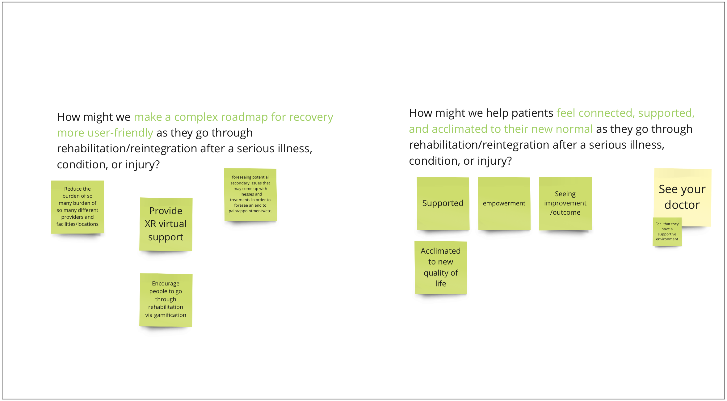
How might we help patients feel connected, supported, and acclimated to their new normal as they go through rehabilitation/reintegration after a serious illness, condition, or injury?
How might we make a complex roadmap for recovery more user-friendly as patients go through rehabilitation/reintegration after a serious illness, condition, or injury?
How might we make a complex roadmap for recovery more user-friendly as patients go through rehabilitation/reintegration after a serious illness, condition, or injury?
HOW IT WORKS
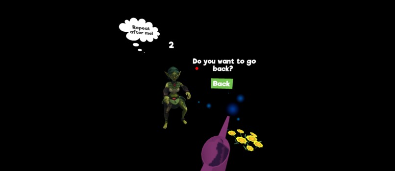
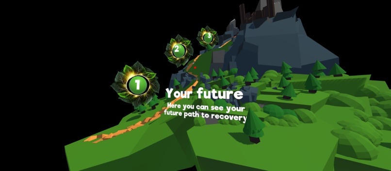
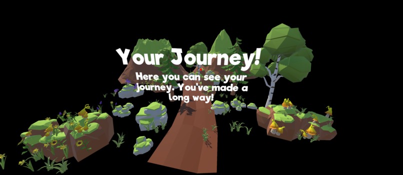
GOALS
︎︎︎ Reduces the burden of information consumption and exchange during long term medical treatments.
︎︎︎ Reframes the process of assimilation to a new normal that integrates holistic rehabilitation tasks and removes outcome-centric framing to support patients in life-long treatment.
︎︎︎ Minimizes isolation in one’s head around the highs, lows, and everyday in-between throughout their journey.
︎︎︎ Brings the user delight and entertainment during at-home therapeutic exercises to reframe what is commonly mundane, repetitive, and a burdensome task to complete.
FEATURES
︎︎︎ Gamification and simple tools for logging completition to facilitate the user in remembering daily functions in treatment journey (therapies, medication, appointments, diet/exercise/lifestyle)
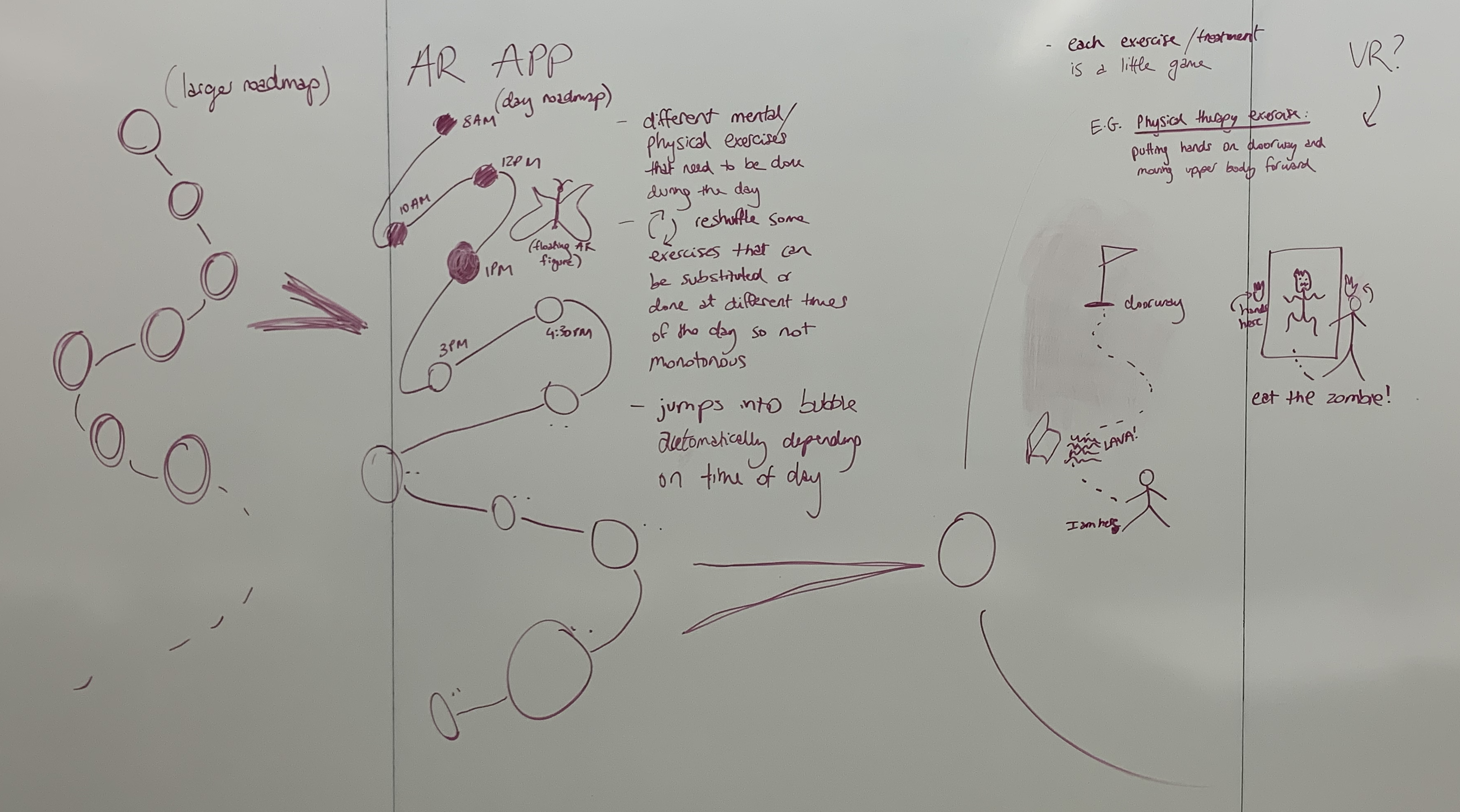
︎︎︎ 3D interactive visualization of progress, goals, and milestones in treatment journey—a more engaging alternative to more common paper documents or 2D UI that patients are responsible for keeping track of
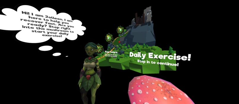
︎︎︎ AR avatar overlaid in the real-world environment to serve as a coach and companion for the user’s journey
︎︎︎ Motion-relevant AR effects during at-home physical therapy exercises for a more engaging experience
0-1 PRODUCT JOURNEY
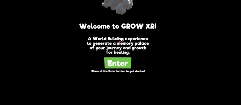
Our prototype is a Mimimum Viable Product (MVP) of the experience for a sample user. Using Snapdragon Spaces SDK, C#/Visual Studio, and Unity Engine, we created a prototype that conveys an end-to-end walkthrough of what typical usage experiences will entail to highlight where XR brings value in this solution. We leveraged and customized many nature-themed assets to implement our underlying theme of a memory palace visually.
Below is the journey our team took to get to our final idea and MVP for the hackathon:
IDEATION
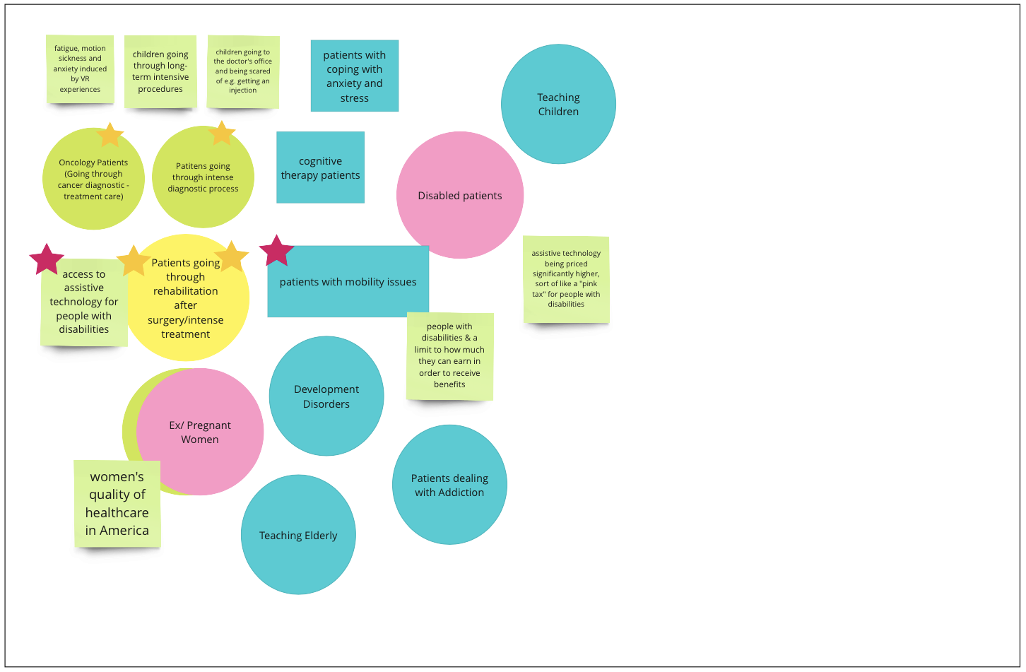
MIRO GROUP WORKSHOP
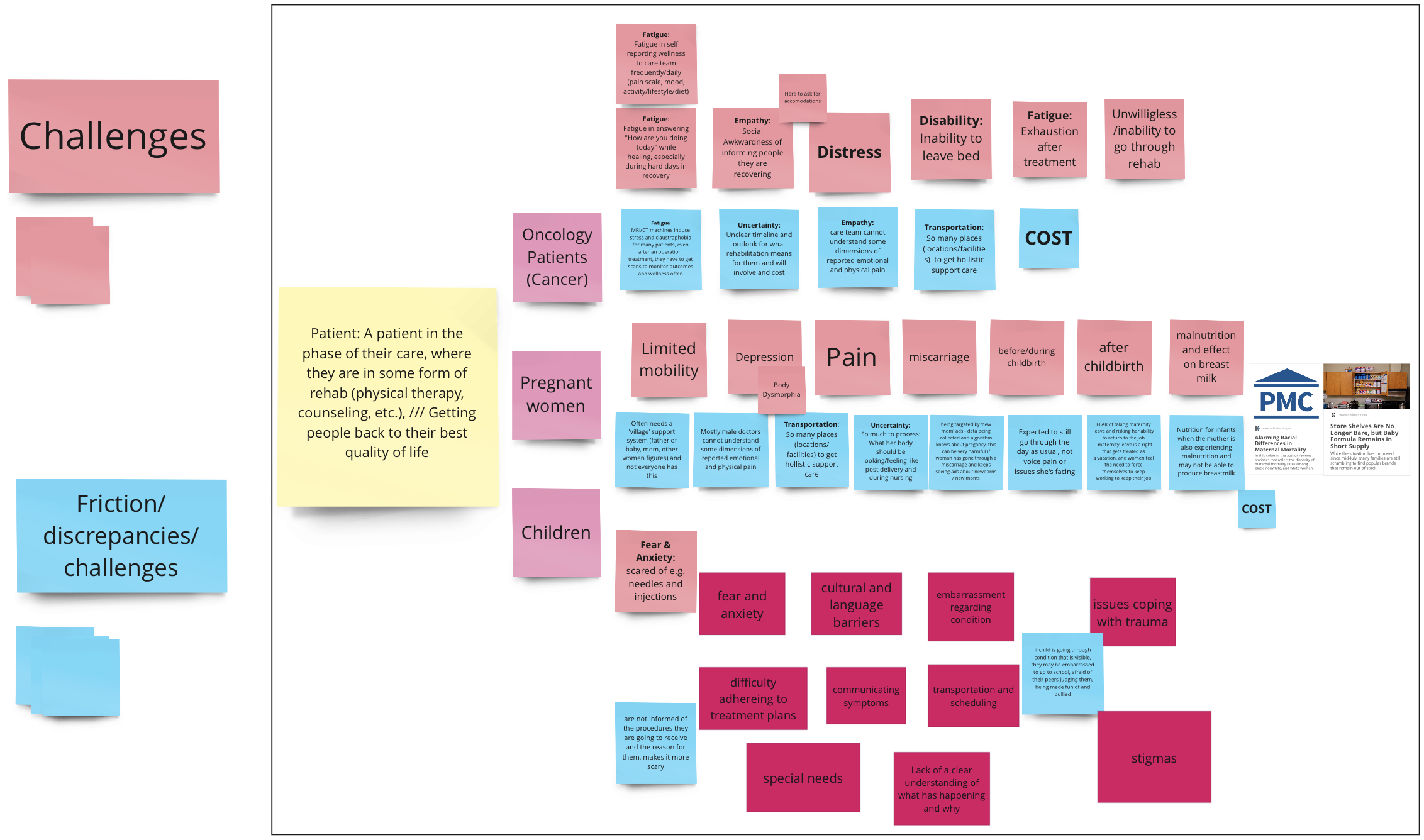
15 min: Users + Pain Points
Identify 2-3 possible patient personals people are interested in exploring solutions for (e.g. oncology patients, pregnant women, low income patients, BIPOC, elderly, pediatric)
For chosen personas, what do they dislike most about their experience in healthcare for serious illnesses? Everyone fills in their individual post-it notes
What discrepancies or challenges does the system and processes in place today present to those people? Everyone fills in their individual post-it notes
15 min: Problem Statements
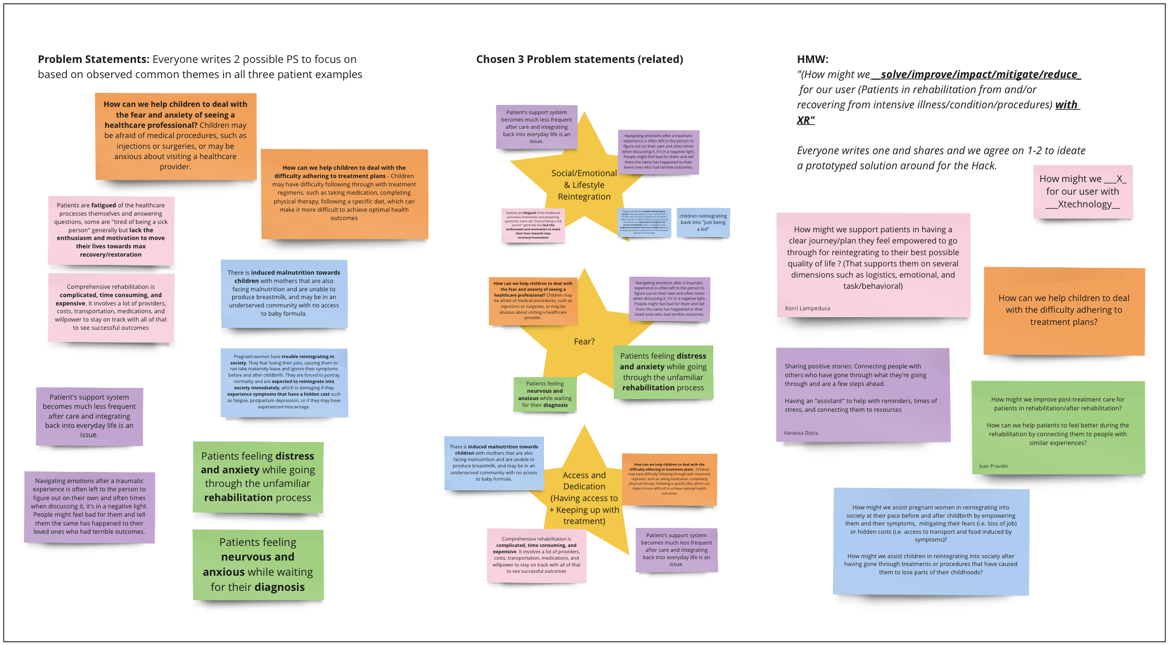
Group common and overlapping themes to make a stronger core story and set of problem statements
Derive “How might we...” statements from grouped problems
Group common and overlapping themes to make a stronger core story and set of problem statements
Derive “How might we...” statements from grouped problems
15 min: Solutions
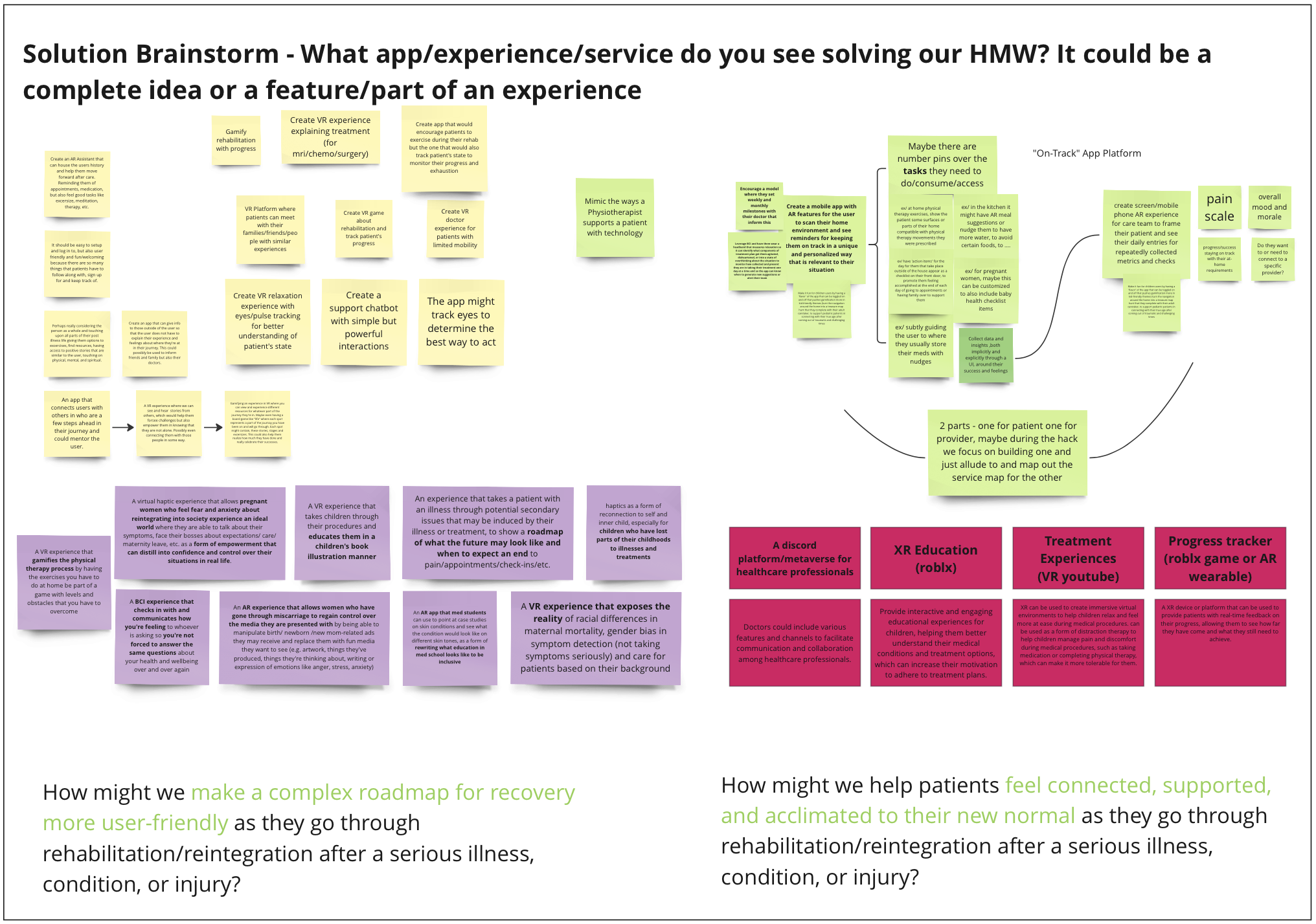
Solution ideation - unstructured independent brainstorm (5 min)
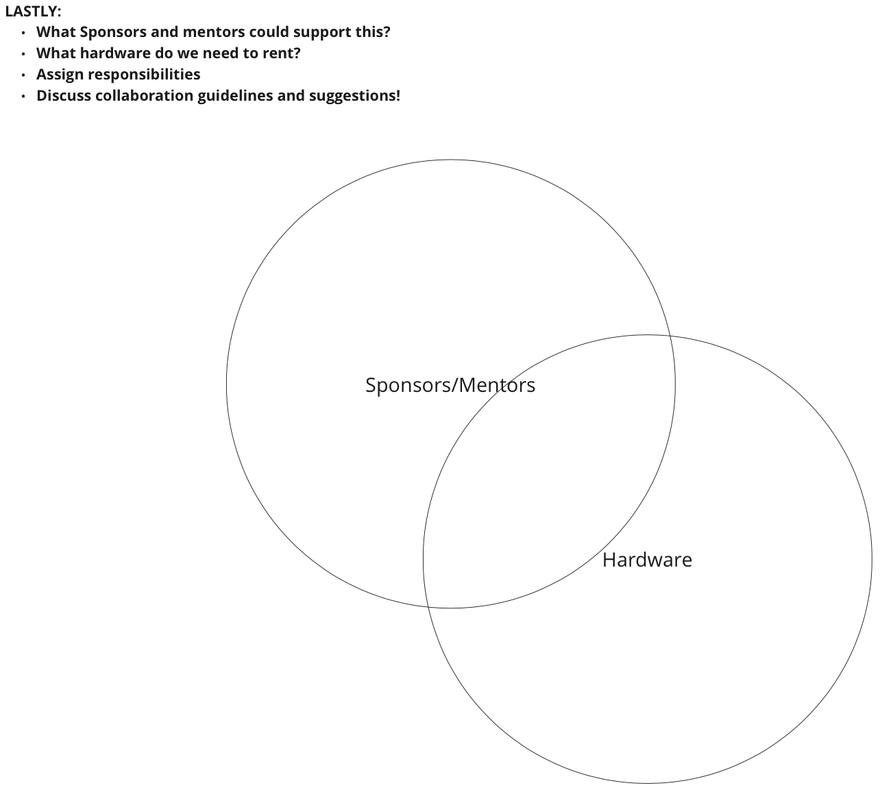
Come together to map out a plan for the prototype for version 1 of a solution, with scope, identification on sponsors/tech to leverage, and decision of hardware (10 min)
Solution ideation - unstructured independent brainstorm (5 min)
Come together to map out a plan for the prototype for version 1 of a solution, with scope, identification on sponsors/tech to leverage, and decision of hardware (10 min)
SOLUTION SKETCHING
Platform
What exactly does it include?
Where do users start?
How do we incentivize users to stay committed to using it?
What exactly does it include?
Where do users start?
How do we incentivize users to stay committed to using it?



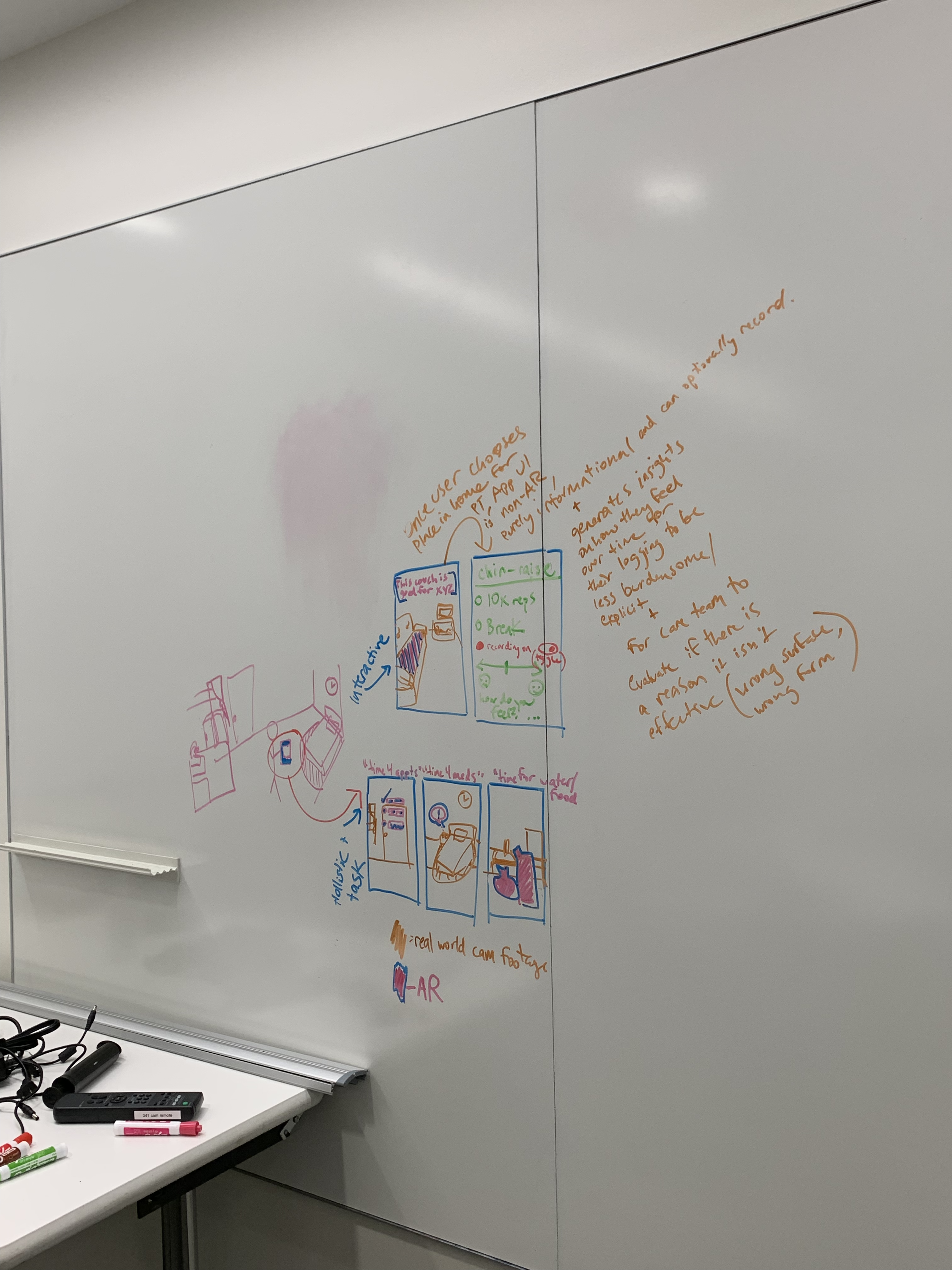

WHY AR?
“Why AR?” was a big question throughout our ideation journey.
RESEARCH, PLANNING & RESPONSIBILITIES
Individual Milestones and Responsibilities
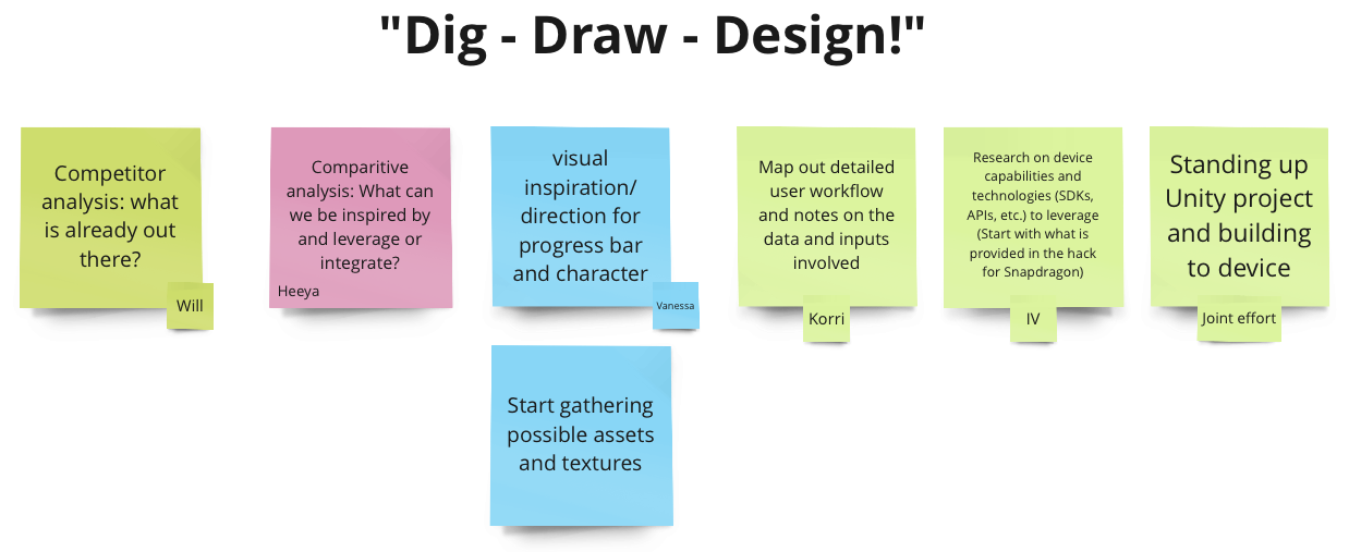
Proof of Concept Workflows


Competitor & Comparative Analysis

Visual & Design Inspiration
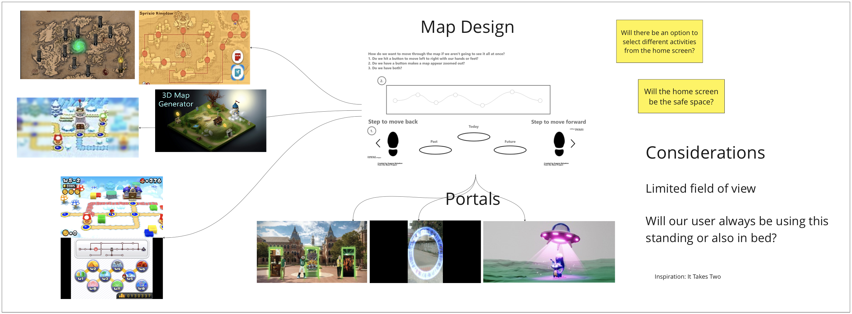
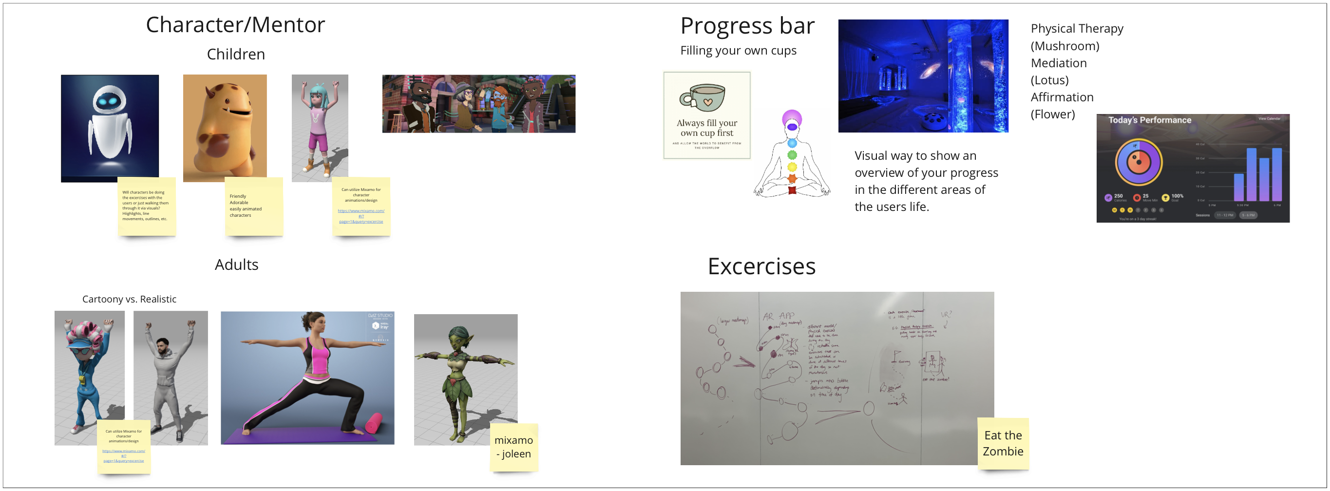

The structure of a group Miro workshop was used to ideate and arrive to a common problem space to target throughout the length of the MIT Reality Hackathon. The dynamic of mixing individual sessions with collaborative group exercises gave opportunity for reflection as we progressed on alignment of ideas, goals and tasks.
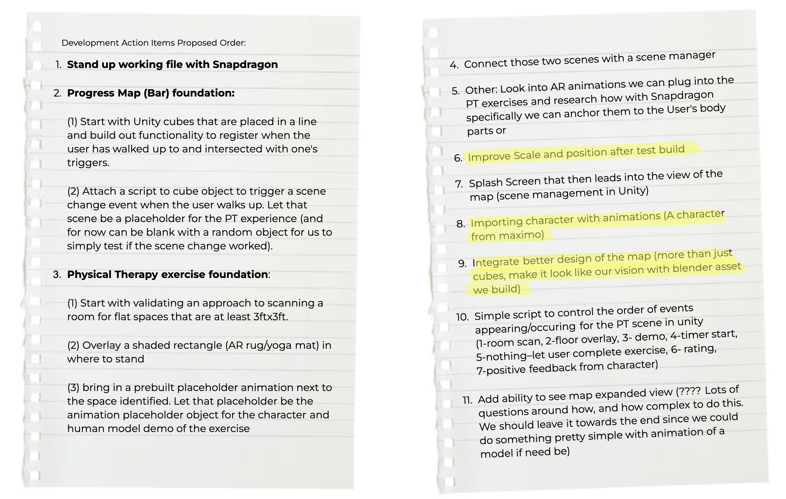
The “Dig — Draw — Design!” method stood at the center of our design and development process. Dig— helped us “dig” through research to gain a deeper understanding of the problem space, map out the various stakeholders at play, analyze the current products and solutions available. Draw— helped us “draw” out various ideas of the look and feel of our product (an instrumental tool for team alignment on vision), after having synthesized the research, and start building out the product roadmap. Design— helped us “design” and build out the ideas we sketched through “dig” and “draw”. Asking burning questions regarding the product, vision, goals, and priorities before reaching the “design” step saved us time, as it ensured that the team was aligned on the product’s vision before we started building the MVP, and reduced confusion when working on individual tasks and responsibilities towards the MVP. Below are the action items we worked through to build out the functionalities of our MVP:
REFLECTIONS
CHALLENGES
We had challenges around scoping this concept and converting the core scope to an set of experience features and product functionalities. There was a lot of passion and identified areas of interest/opportunity across our group, so we spent significant time aligning on the precise problem to solve for and then narrowing down to get a detailed user persona in focus that could drive our ideas for functionality and design language/styling throughout the experience. Many of our critical moments of challenge were around repivoting to keep design and development actions aligned as we build out the experience's MVP.
ACCOMPLISHMENTS
We are most proud of:
(1) Managing and building a multi-scene project in Unity that has a consistent visual theme across scenes
(2) Implementation of interactability on a platform/hardware device that was new to all of us
(3) Powerful and collaborative concept development as a team of cross-functional creatives on a big and emotional problem space
(4) Prototyped implementation of all the major ways XR tech/effects brings value for the solution
LEARNINGS
I learned many new technical concepts involving the device/environment set-up for the ThinkReality glasses, from setting up default/example environments to building the functionalities of our own GROW XR environment. I also learned to modify leveraged 3D assets, which made me appreciate the general movement of technology into open-source to build on and repurpose the work that is already out there, rather than delaying innovations by trying to reinvent the wheel.
Learning to narrow scope based on timeline and resources was a major takeaway. GROW XR started out with many features, such as: (1) a daily and monthly progress bar with levels, (2) a character/friend, daily exercises, (3) educational resources, (4) virtual mentoring, and (5) a cozy environment/safe space. Each of these features were derived to target key elements within the problem space that our target users (patients in long-term care) face.
NEXT STEPS
Future Directions we outlined include: (1) Give access to health provider to modify rehabilitation routine. (2) Add bigger variety of exercise, including mental exercise. (3) Include education resources for specific conditions. (4) Implement a way to create "safe space" for users. (5) Allow users to bring assets of their choice into the experience.
Free Models Leveraged:
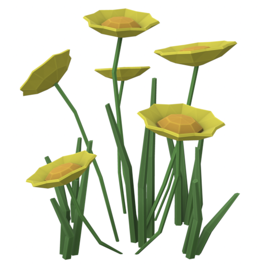
Flowers (Marigold)
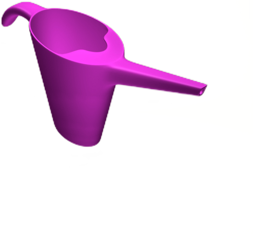
Watering Can
Free Low Poly Nature Forest
Character model
Mountaintop
Font
Sound
Flowers (Marigold)
Watering Can
Free Low Poly Nature Forest
Character model
Mountaintop
Font
Sound
In Collaboration With:
Korri Lampedusa
IV Pravdin
Vanessa Dutra
Will Hatcher
Korri Lampedusa
IV Pravdin
Vanessa Dutra
Will Hatcher